


In this blog post, we will explore how to create modals in Payload NextJS that seamlessly integrate with your dashboard. By following this guide, you will learn to set up modals that look and feel just like the native Payload modals, complete with custom actions and styling.
For a visual demonstration of these concepts, you can follow along with our detailed video tutorial available at:
https://www.youtube.com/watch?v=JxJR0-o0pvA
Table of Contents
- Introduction to Modals in Payload NextJS
- Importing Necessary Components
- Setting Up the Modal Environment
- Creating the Modal Structure
- Testing the Modal Functionality
- Understanding the Payload Modal Component
- Utilizing Faceless UI for Modals
- Styling the Modal with CSS Classes
- Adding Action Buttons to the Modal
- Final Adjustments and Customizations
- Frequently Asked Questions
Introduction to Modals in Payload NextJS
Modals are a powerful way to enhance user interaction in your applications. In Payload NextJS, creating modals that resemble the native experience provided by Payload is straightforward and effective. This section will introduce you to the concept of modals and their significance within your dashboard.
Modals serve as temporary overlays that prompt users for input or display information without navigating away from the current page. This keeps the user experience fluid and engaging. By implementing modals in your Payload NextJS application, you can streamline processes such as form submissions, confirmations, or displaying critical information.
Benefits of Using Modals
- Improved User Experience: Modals allow users to interact with content without losing their context.
- Efficient Workflow: Users can complete tasks quickly without navigating away from their current view.
- Customizable: Modals can be tailored to fit the specific needs of your application.
Importing Necessary Components
To get started with modals in Payload NextJS, you need to import the required components. The primary components include the modal itself and a hook for managing modal visibility.
Here’s how to import these components:
import { Modal, useModal } from 'payload/components';
Using the useModal hook is essential as it allows you to control the opening and closing of the modal. This hook provides a function that you can call to toggle the modal's visibility based on user actions.
Setting Up the Modal Environment
Before creating a modal, ensure your environment is set up correctly. You’ll need a minimal template that aligns with the Payload styling conventions. This template serves as the structure for your modal.
Here’s a basic setup example:
const toggleModal = useModal('modalSlug');
In this line, you define a unique slug for your modal, allowing you to manage multiple modals effectively. Each modal should have a distinct slug to avoid conflicts.
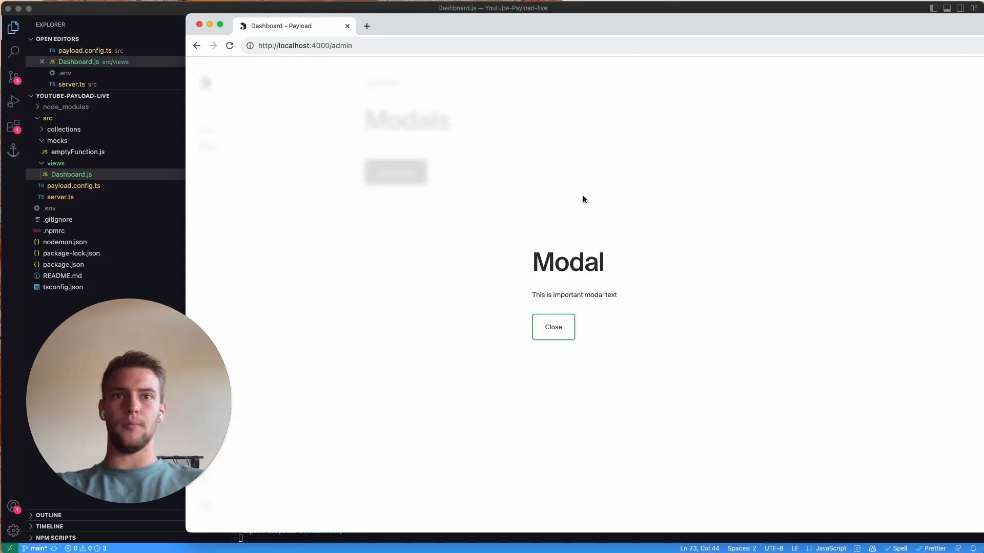
Creating the Modal Structure
Now that the environment is ready, you can create the modal structure. Start by using the Modal component and assigning it the previously defined slug.
The MinimalTemplate is crucial for maintaining the design consistency with other Payload components. Inside this template, you can add any content you want to display within the modal.

Testing the Modal Functionality
Once your modal structure is complete, it’s time to test its functionality. Ensure that the modal opens and closes as expected when triggered by user interactions. This is typically done through button clicks.
To implement the button, you can use the following code:
toggleModal('modalSlug')}>Open Modal
By clicking this button, the modal should appear, displaying the content you defined. Make sure to check the console for any errors that may arise during functionality testing.
Understanding the Payload Modal Component
The Payload modal component is built on top of the Headless UI framework, which allows for a flexible and accessible modal experience. Understanding its properties and methods is key to harnessing its full potential.
Key aspects to note include:
- Accessibility: The Payload modal is designed to be accessible, ensuring that all users can interact with it effectively.
- Styling: You can apply custom styles to match your application's branding while adhering to the Payload design guidelines.
- Event Handling: Utilize callback functions to handle events like form submissions or button clicks within the modal.
By mastering the Payload modal component, you can create engaging and user-friendly interfaces that enhance the overall experience of your application.
Utilizing Faceless UI for Modals
Faceless UI is a powerful tool that Payload NextJS leverages to create modals that are not only functional but also stylistically consistent with the rest of the application. By using Faceless UI, we can create modals that are both accessible and visually appealing.
To utilize Faceless UI, ensure you have the necessary components imported. The Modal and useModal hook are essential for managing modal visibility effectively. This allows you to trigger the modal based on user interactions, making the experience seamless.

Styling the Modal with CSS Classes
Styling your modal is crucial for maintaining visual coherence within your application. Payload NextJS provides a set of CSS classes that you can use to style your modals. These classes ensure that your modals fit perfectly within the overall aesthetic of the Payload ecosystem.
When creating your modal, apply the relevant CSS classes to both the modal and the minimal template. For example, use the class delete document for the modal to maintain consistency with other Payload modals.
Additionally, ensure that your minimal template has the class delete document template. This will help with the layout and styling of the content inside the modal.
Adding Action Buttons to the Modal
Action buttons are a critical component of modals, allowing users to perform specific tasks. You can create buttons for actions like saving data or closing the modal. Each button should be styled appropriately to indicate its function clearly.
For instance, you might have a primary button for confirming an action and a secondary button for canceling or closing the modal. Use the onClick event handler to trigger the appropriate functions. This could include logging actions or updating states based on user input.
Here's an example of adding action buttons:
toggleModal('modalSlug')}>Close console.log('Model action triggered')}>Apply
This setup allows for a clear user experience where actions are easily identifiable and functional.
Final Adjustments and Customizations
Once your modal is functional, it’s time to fine-tune its appearance and behavior. Consider adding padding or margins to ensure the content is well-spaced. This enhances readability and aesthetic appeal.
Additionally, review your CSS classes for any necessary adjustments. For example, ensure that buttons are grouped logically and styled consistently. Using a wrapper div with the class delete document actions can help in organizing the action buttons neatly.
Here’s how you might structure the action buttons within a div:
Closeconsole.log('Action performed')}>Apply
With these adjustments, your modal will not only function well but also look great, providing a polished user experience.
Frequently Asked Questions
What is the purpose of using the useModal hook?
The useModal hook allows you to manage the visibility of your modals efficiently. It provides a function to toggle the modal's state based on user interactions, making it easy to control when the modal appears or disappears.
Can I customize the modal's appearance?
Yes, you can customize the modal's appearance by applying CSS classes that align with your branding. Payload NextJS provides default classes, but you can also create your own styles to enhance the modal's look.
How do I handle actions within the modal?
You can handle actions within the modal by attaching onClick event handlers to your buttons. This allows you to define specific functions that should be executed when users interact with the buttons, such as saving data or closing the modal.


